
Page 26 - 1
P. 26
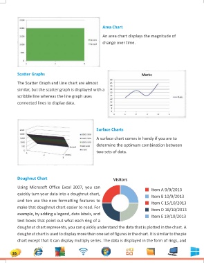
Area Chart

                                                   An area chart displays the magnitude of
                                                   change over time.

    Scatter Graphs

    The Scatter Graph and Line chart are almost
    similar, but the scatter graph is displayed with a
    scribble line whereas the line graph uses
    connected lines to display data.

                    Surface Charts

                    A surface chart comes in handy if you are to
                    determine the optimum combination between
                    two sets of data.

    Doughnut Chart                                      Visitors

    Using Microsoft Office Excel 2007, you can                    Item A 9/9/2013
    quickly turn your data into a doughnut chart,                 Item B 10/9/2013
    and ten use the new formatting features to                    Item C 15/10/2013
    make that doughnut chart easier to read. For                  Item D 18/10/2013
    example, by adding a legend, data labels, and                 Item E 19/10/2013
    text boxes that point out what each ring of a

    doughnut chart represents, you can quickly understand the data that is plotted in the chart. A

    doughnut chart is used to display more than one set of figures in the chart. It is similar to the pie

    chart except that it can display multiply series. The data is displayed in the form of rings, and

26